When choosing what colors to use, we recommend starting with semantic colors as their usage is clearly defined and common color pairings are accessible out of the box.
Color styles and tokens
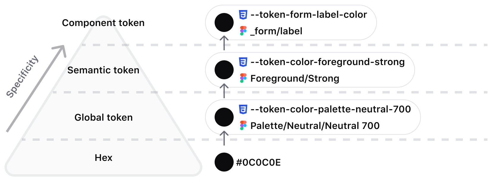
Color-naming syntax and usage can vary depending on context and tooling. This overview will clarify what naming conventions are typically used and how they align with the HDS standards implemented in our libraries.
In Figma, reusable colors are referred to as “Styles.” They are categorized and stored in the right sidebar for fills, borders, and other properties that accept color values. Styles directly reference a HEX value but cannot reference each other (known as aliasing for Tokens). This means when we provide Figma Styles for semantic usage (like Foreground/Primary), the HEX value (#3B3D45) is directly referenced instead of the Core Palette color (Palette/Neutral/Neutral 600).
In code, we refer to reusable colors as “Tokens.” They are generated from platform-agnostic files, in our case JSON, and create atomic colors regardless of what platform or framework is used. For example, Core Palette colors like --token-color-palette-neutral-600 are directly referenced in --token-color-foreground-primary.
What are semantic colors?
The Semantic Palette helps ensure proper color usage across applications by embedding meaning directly into the name.
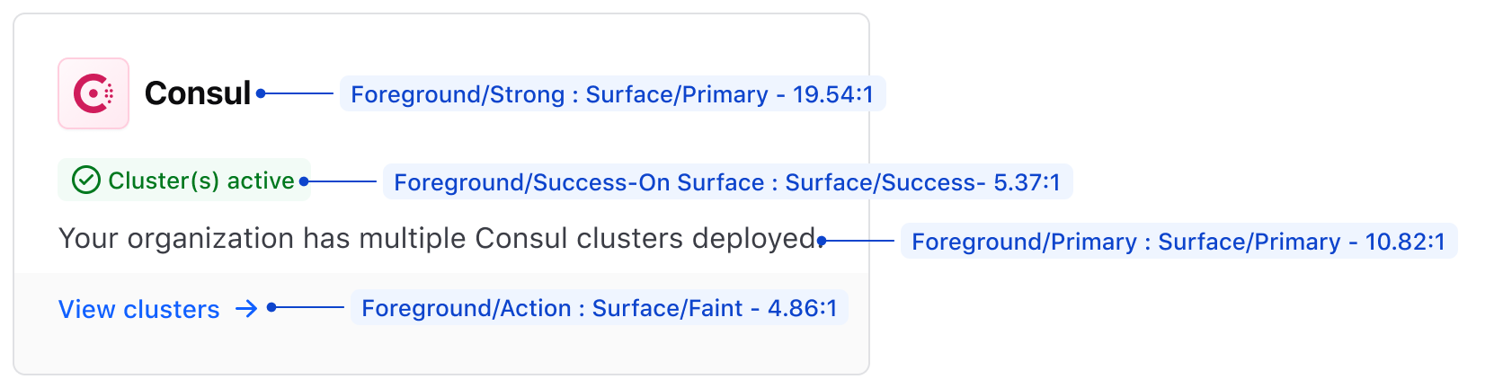
Semantic colors were designed to be used together, ensuring they meet accessibility standards and look visually pleasing. For example, foreground colors are intended to be used with surface or page colors. In many cases, it is important to use specific contextual naming conventions, such as status colors, together. Here are some examples of semantic color combinations with their respective contrast ratios:
Foreground/StrongonSurface/Primarynets a ratio of 19.54:1Foreground/Success-on SurfaceonSurface/Successnets a ratio of 5.37:1Foreground/PrimaryonSurface/Primarynets a ratio of 10.82:1Foreground/ActiononSurface/Faintnets a ratio of 4.86:1
The element and the role are referenced in the name to help make more informed color decisions.
HDS organizes semantic tokens into element categories:
- Foreground - For elements such as text, links, statuses, and icons.
- Border - For borders on components, containers, or dividers.
- Surface - For the background (or surface) of a component or container
- Page - For page backgrounds
Examples of role naming conventions include:
- Strong
- Primary
- Faint
- Action (not to be used outside of context)
- Disabled (not to be used outside of context)
Foreground colors
Foreground colors are used for elements such as text, links, and icons.
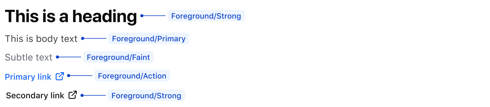
Some common examples of semantic foreground colors include:
Foreground/Strongfor headings and secondary linksForeground/Primaryfor body textForeground/Faintfor less prominent text and UI elements.Foreground/Actionfor primary call to action such as links
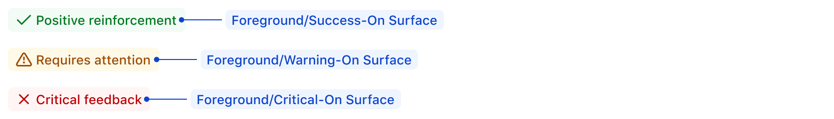
Use status foreground colors to help contextualize responses from user actions or to indicate status within a UI. These colors should be used sparingly and within the context of specific components like Alerts, Toasts, or Badges.
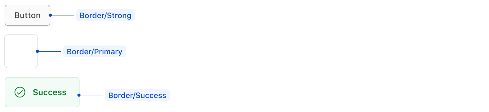
Border colors
Some common examples of border colors include:
Border/Strongfor secondary Button borderBorder/Primaryfor Card border or dividerBorder/{Status color}for Alert borders
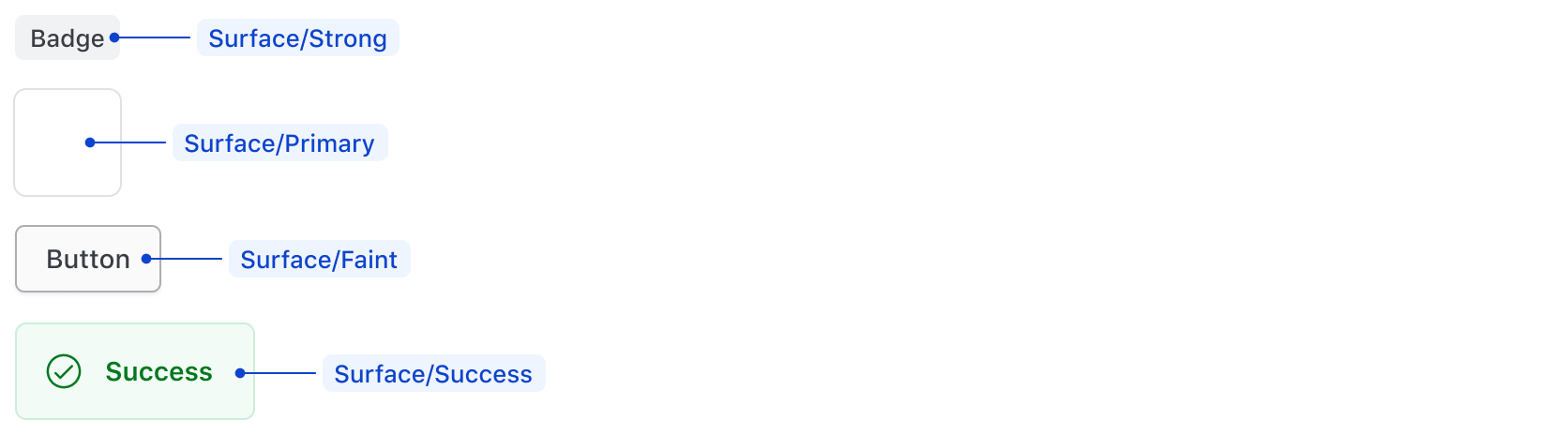
Surface colors
Use surface colors for the background (or surface) of a component or container.
Some common examples of surface colors include:
Surface/Strongfor the neutral Badge.Surface/Primaryfor component containers.Surface/Faintfor the secondary Button.Surface/{Status color}for Alert background.
Page colors
Page colors are used for page backgrounds. HDS components do not use these tokens; however, we recommend Page/Primary as the primary background color and Page/Faint as a means to create a secondary level on the page for highlighting information, if necessary.
Accessible color combinations
We intend to be conformant with WCAG 2.2 Level AA requirements. In terms of color contrast, this means a luminosity ratio of 4.5:1 for normal sized text, and 3:1 for large text (commonly 22px). Further details are outlined on WCAG’s understanding of Contrast (Minimum). By default, semantic color tokens provide accessible color combinations out of the box with their associated naming conventions, while using palette colors requires manual validation, especially if you plan to mix and match. As an example, if a color has a semantic status name in it, then other associated status colors will be accessible.
It is important to note that we do not recommend the usage of disabled elements, especially isolating disabled colors out of context, as they are not accessible.
Using palette colors
The Core Palette is available if semantic colors do not meet your needs. These styles are usage-agnostic, which can introduce challenges in consistently scaling designs but also allow more freedom and flexibility in color pairing.
When pairing colors from the Core Palette, ensure adjacent colors meet accessible contrast ratios. To validate your color combinations, use free tools like the WebAIM contrast checker or Stark’s Figma plugin.
How to use these styles
We offer two ways to apply color to a UI element: CSS helper classes or design tokens.
We currently only provide CSS helpers for the “semantic” colors, so if you need to use the “palette” or “product/brand” colors, use the design tokens as CSS variables instead.
CSS helper classes
- Ensure you’ve imported the relevant CSS file.
// for product applications
@import "~@hashicorp/design-system-tokens/dist/products/css/helpers/colors.css";

// for hashicorp developer platform
@import "~@hashicorp/design-system-tokens/dist/devdot/css/helpers/colors.css";
- Use one of the predefined CSS helper classes.
<div class="hds-foreground-primary hds-surface-faint hds-border-strong">...</div>
Design tokens
Use the color design tokens directly in your CSS definitions.
.your-selector {
  color: var(--token-color-foreground-primary);
  background: var(--token-color-surface-faint);
  border: (--token-color-border-strong);
  & :hover {
    color: var(--token-color-foreground-high-contrast);
    background: var(--token-color-foreground-action-active);
  }
}
Semantic tokens
Foreground
Use for text and icons.
foreground-strong
- CSS Variable
- CSS Helper
- HEX
foreground-primary
- CSS Variable
- CSS Helper
- HEX
foreground-faint
- CSS Variable
- CSS Helper
- HEX
foreground-high-contrast
- CSS Variable
- CSS Helper
- HEX
foreground-disabled
- CSS Variable
- CSS Helper
- HEX
foreground-action
- CSS Variable
- CSS Helper
- HEX
foreground-action-hover
- CSS Variable
- CSS Helper
- HEX
foreground-action-active
- CSS Variable
- CSS Helper
- HEX
foreground-highlight
- CSS Variable
- CSS Helper
- HEX
foreground-highlight-on-surface
- CSS Variable
- CSS Helper
- HEX
foreground-highlight-high-contrast
- CSS Variable
- CSS Helper
- HEX
foreground-success
- CSS Variable
- CSS Helper
- HEX
foreground-success-on-surface
- CSS Variable
- CSS Helper
- HEX
foreground-success-high-contrast
- CSS Variable
- CSS Helper
- HEX
foreground-warning
- CSS Variable
- CSS Helper
- HEX
foreground-warning-on-surface
- CSS Variable
- CSS Helper
- HEX
foreground-warning-high-contrast
- CSS Variable
- CSS Helper
- HEX
foreground-critical
- CSS Variable
- CSS Helper
- HEX
foreground-critical-on-surface
- CSS Variable
- CSS Helper
- HEX
foreground-critical-high-contrast
- CSS Variable
- CSS Helper
- HEX
Surface
Use for container and component backgrounds.
surface-primary
- CSS Variable
- CSS Helper
- HEX
surface-faint
- CSS Variable
- CSS Helper
- HEX
surface-strong
- CSS Variable
- CSS Helper
- HEX
surface-interactive
- CSS Variable
- CSS Helper
- HEX
surface-interactive-hover
- CSS Variable
- CSS Helper
- HEX
surface-interactive-active
- CSS Variable
- CSS Helper
- HEX
surface-interactive-disabled
- CSS Variable
- CSS Helper
- HEX
surface-action
- CSS Variable
- CSS Helper
- HEX
surface-highlight
- CSS Variable
- CSS Helper
- HEX
surface-success
- CSS Variable
- CSS Helper
- HEX
surface-warning
- CSS Variable
- CSS Helper
- HEX
surface-critical
- CSS Variable
- CSS Helper
- HEX
Border
Use for container and component borders. Neutral values can also be used for horizontal rules.
border-primary
- CSS Variable
- CSS Helper
- HEX
border-faint
- CSS Variable
- CSS Helper
- HEX
border-strong
- CSS Variable
- CSS Helper
- HEX
border-action
- CSS Variable
- CSS Helper
- HEX
border-highlight
- CSS Variable
- CSS Helper
- HEX
border-success
- CSS Variable
- CSS Helper
- HEX
border-warning
- CSS Variable
- CSS Helper
- HEX
border-critical
- CSS Variable
- CSS Helper
- HEX
Focus
Use to indicate an element is in a focused state. Use critical values for critical actions only and action values for everything else.
focus-action
- CSS Variable
- HEX
focus-action
- CSS Variable
- HEX
focus-critical
- CSS Variable
- HEX
focus-critical
- CSS Variable
- HEX
Page
Use for page backgrounds.
page-primary
- CSS Variable
- CSS Helper
- HEX
page-faint
- CSS Variable
- CSS Helper
- HEX
Brand colors
Hashicorp
hashicorp-brand
- CSS Variable
- HEX
Boundary
boundary-brand
- CSS Variable
- HEX
boundary-foreground
- CSS Variable
- HEX
boundary-surface
- CSS Variable
- HEX
boundary-border
- CSS Variable
- HEX
boundary-gradient
- CSS Variable
- HEX
boundary-gradient
- CSS Variable
- HEX
boundary-gradient
- CSS Variable
- HEX
boundary-gradient
- CSS Variable
- HEX
Consul
consul-brand
- CSS Variable
- HEX
consul-foreground
- CSS Variable
- HEX
consul-surface
- CSS Variable
- HEX
consul-border
- CSS Variable
- HEX
consul-gradient
- CSS Variable
- HEX
consul-gradient
- CSS Variable
- HEX
consul-gradient
- CSS Variable
- HEX
consul-gradient
- CSS Variable
- HEX
Hcp
hcp-brand
- CSS Variable
- HEX
Nomad
nomad-brand
- CSS Variable
- HEX
nomad-foreground
- CSS Variable
- HEX
nomad-surface
- CSS Variable
- HEX
nomad-border
- CSS Variable
- HEX
nomad-gradient
- CSS Variable
- HEX
nomad-gradient
- CSS Variable
- HEX
nomad-gradient
- CSS Variable
- HEX
nomad-gradient
- CSS Variable
- HEX
Packer
packer-brand
- CSS Variable
- HEX
packer-foreground
- CSS Variable
- HEX
packer-surface
- CSS Variable
- HEX
packer-border
- CSS Variable
- HEX
packer-gradient
- CSS Variable
- HEX
packer-gradient
- CSS Variable
- HEX
packer-gradient
- CSS Variable
- HEX
packer-gradient
- CSS Variable
- HEX
Terraform
terraform-brand
- CSS Variable
- HEX
terraform-brand-on-dark
- CSS Variable
- HEX
terraform-foreground
- CSS Variable
- HEX
terraform-surface
- CSS Variable
- HEX
terraform-border
- CSS Variable
- HEX
terraform-gradient
- CSS Variable
- HEX
terraform-gradient
- CSS Variable
- HEX
terraform-gradient
- CSS Variable
- HEX
terraform-gradient
- CSS Variable
- HEX
Vagrant
vagrant-brand
- CSS Variable
- HEX
vagrant-foreground
- CSS Variable
- HEX
vagrant-surface
- CSS Variable
- HEX
vagrant-border
- CSS Variable
- HEX
vagrant-gradient
- CSS Variable
- HEX
vagrant-gradient
- CSS Variable
- HEX
vagrant-gradient
- CSS Variable
- HEX
vagrant-gradient
- CSS Variable
- HEX
Vault-radar
vault-radar-brand
- CSS Variable
- HEX
vault-radar-brand-alt
- CSS Variable
- HEX
vault-radar-foreground
- CSS Variable
- HEX
vault-radar-surface
- CSS Variable
- HEX
vault-radar-border
- CSS Variable
- HEX
vault-radar-gradient
- CSS Variable
- HEX
vault-radar-gradient
- CSS Variable
- HEX
vault-radar-gradient
- CSS Variable
- HEX
vault-radar-gradient
- CSS Variable
- HEX
Vault-secrets
vault-secrets-brand
- CSS Variable
- HEX
vault-secrets-brand-alt
- CSS Variable
- HEX
vault-secrets-foreground
- CSS Variable
- HEX
vault-secrets-surface
- CSS Variable
- HEX
vault-secrets-border
- CSS Variable
- HEX
vault-secrets-gradient
- CSS Variable
- HEX
vault-secrets-gradient
- CSS Variable
- HEX
vault-secrets-gradient
- CSS Variable
- HEX
vault-secrets-gradient
- CSS Variable
- HEX
Vault
vault-brand
- CSS Variable
- HEX
vault-brand-alt
- CSS Variable
- HEX
vault-foreground
- CSS Variable
- HEX
vault-surface
- CSS Variable
- HEX
vault-border
- CSS Variable
- HEX
vault-gradient
- CSS Variable
- HEX
vault-gradient
- CSS Variable
- HEX
vault-gradient
- CSS Variable
- HEX
vault-gradient
- CSS Variable
- HEX
Waypoint
waypoint-brand
- CSS Variable
- HEX
waypoint-foreground
- CSS Variable
- HEX
waypoint-surface
- CSS Variable
- HEX
waypoint-border
- CSS Variable
- HEX
waypoint-gradient
- CSS Variable
- HEX
waypoint-gradient
- CSS Variable
- HEX
waypoint-gradient
- CSS Variable
- HEX
waypoint-gradient
- CSS Variable
- HEX
Core palette
Core palette colors should be used sparingly and only when the correct semantic mapping isn’t available for the use case.
Blue
blue-500
- CSS Variable
- HEX
blue-400
- CSS Variable
- HEX
blue-300
- CSS Variable
- HEX
blue-200
- CSS Variable
- HEX
blue-100
- CSS Variable
- HEX
blue-50
- CSS Variable
- HEX
Purple
purple-500
- CSS Variable
- HEX
purple-400
- CSS Variable
- HEX
purple-300
- CSS Variable
- HEX
purple-200
- CSS Variable
- HEX
purple-100
- CSS Variable
- HEX
purple-50
- CSS Variable
- HEX
Green
green-500
- CSS Variable
- HEX
green-400
- CSS Variable
- HEX
green-300
- CSS Variable
- HEX
green-200
- CSS Variable
- HEX
green-100
- CSS Variable
- HEX
green-50
- CSS Variable
- HEX
Amber
amber-500
- CSS Variable
- HEX
amber-400
- CSS Variable
- HEX
amber-300
- CSS Variable
- HEX
amber-200
- CSS Variable
- HEX
amber-100
- CSS Variable
- HEX
amber-50
- CSS Variable
- HEX
Red
red-500
- CSS Variable
- HEX
red-400
- CSS Variable
- HEX
red-300
- CSS Variable
- HEX
red-200
- CSS Variable
- HEX
red-100
- CSS Variable
- HEX
red-50
- CSS Variable
- HEX
Neutral
neutral-700
- CSS Variable
- HEX
neutral-600
- CSS Variable
- HEX
neutral-500
- CSS Variable
- HEX
neutral-400
- CSS Variable
- HEX
neutral-300
- CSS Variable
- HEX
neutral-200
- CSS Variable
- HEX
neutral-100
- CSS Variable
- HEX
neutral-50
- CSS Variable
- HEX
neutral-0
- CSS Variable
- HEX
Alpha
alpha-300
- CSS Variable
- HEX
alpha-200
- CSS Variable
- HEX
alpha-100
- CSS Variable
- HEX